
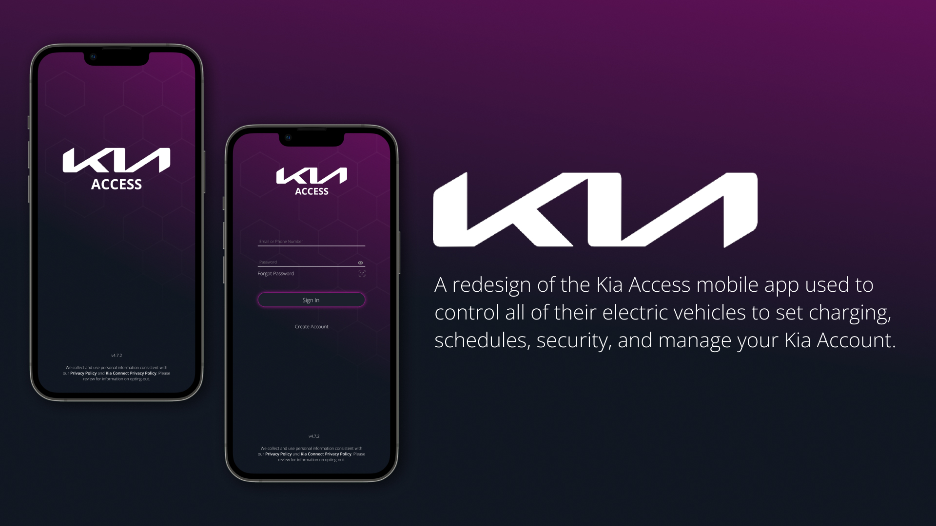
Kia Access Mobile App
Client
Kia of America
(Self-initiated)
Roles
UX/UI Designer, Researcher, User Testing
Case Study
View as PDFI made it look fancy at least.
Background
Earlier this year I bought a new Kia vehicle and learned there was an app that came with it. Naturally, I was excited to link my tech background with my love of cars, so I was eager to give it a try. After a couple of days, I was... less than impressed.
Problem
It did the things I needed, but it was clumsy and unintuitive. There were items on the home screen that are rarely used, while frequently used items are buried in sub-menus. I knew it needed to be better.
Design Goals
It was important to focus on a hierarchy of use, starting with the most important items and information on the home screen, and then working our way through a secondary set of needs, and finally the tertiary items. I tried to keep the branding and colors consistent with the Kia brand that already exists, while making improvements where possible for readibility and contrast.
The process.
Research
I decided to remove my own bias from the design process and poll other users from within the Kia community using social media. There were no shortage of responses so I started simply cataloging all of the various suggestions onto cards and noting the frequency of responses.
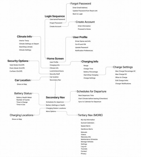
Once I had all of the cards organized, I then took those suggestions and created an online card sorting program which would allow a sub-sample of those users create a hierarchy of items and categorize them in a way that made the most sense to them. I used this research to create a Mind Map in Miro.
Mind Map in Miro
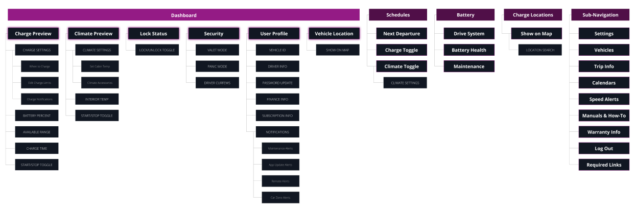
Information Architecture
I started simplifying the mind map and used it to create the formal Information Architecture that eventually lead my design decisions.
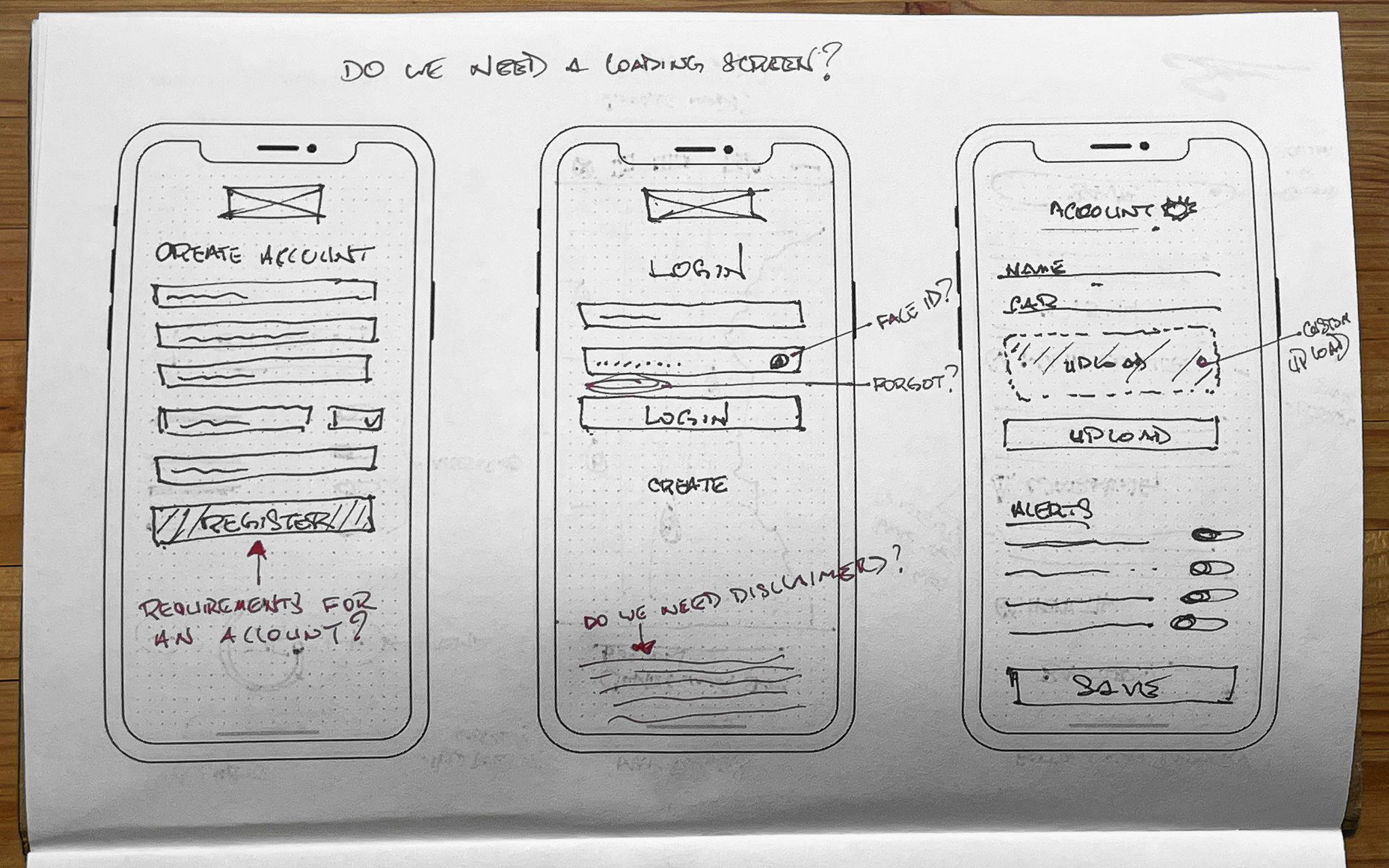
Initial Sketches and Ideation
I began working through the process in chronological order. Starting with the loading screen, login screens, error states, how to create an account, and update your profile. I then thought about basic functionality of the dashboard, using the Mind Map and IA to guide the placement of objects on the page in the proper hierarchy.
I looked for every opportunity to simplify this from the current method and had to rethink the design a couple of times for space constraints and polled users for feedback as I went along.
Initial Sketches


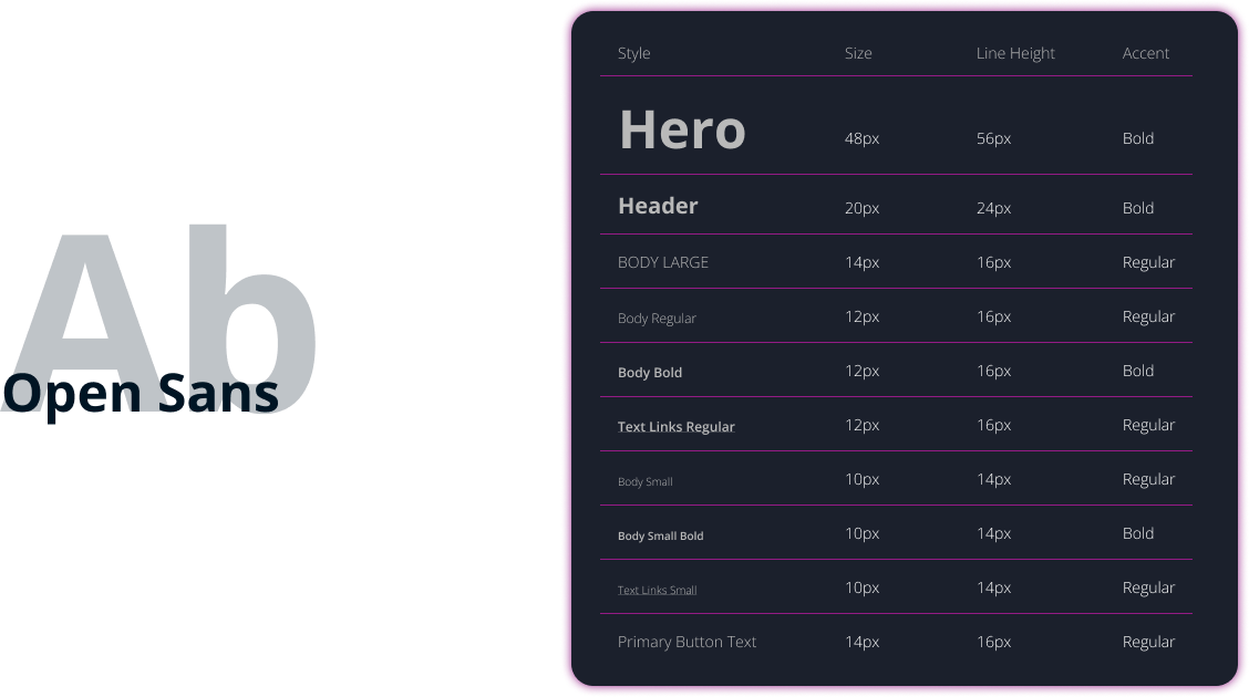
Design System
In trying to keep consistency with the current Kia branding, I chose colors and fonts from their existing Design System while making slight adjustments for readability and contrast. The kia font system is inconsistent in its current form and I knew I could fix that with just a few tweaks.

Component Library
Once it was time to begin creating high-fidelity prototypes for all of the various sequences we had outlined, we knew there would be some custom icons and components that we need to create. We built these out as needed and refined them as we went along for better clarity.


Prototypes
With the colors and typography in place, it was just a matter of applying them to the final wireframes to create our final prototypes.
Login and Account Creation

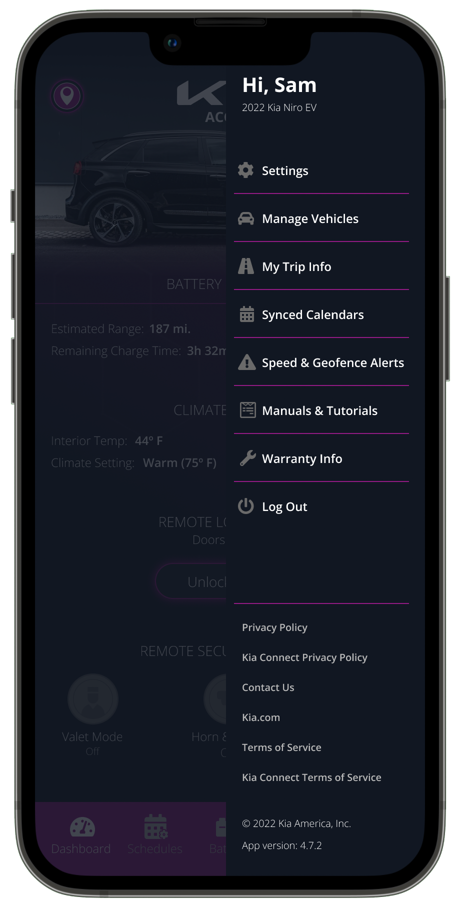
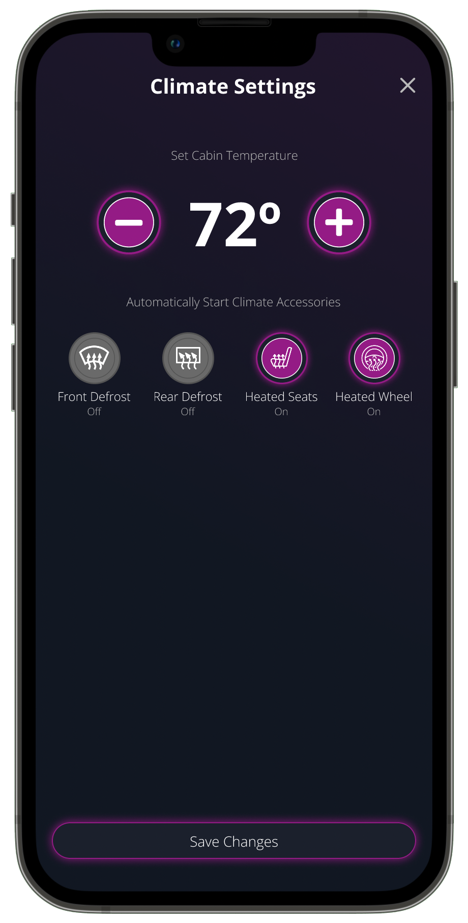
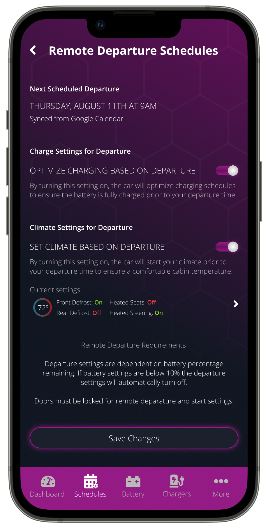
Kia Dashboard Sequence

The Final Product.
I feel like this project presented new challenges that I wasn't expecting, and highlights the difficulty of trying to build an "app for everyone." In this instance, we tried to get every single user request in the prototype even if only one person requested it. Mostly for the challenge, but also to include things I maybe didn't think about.


The result is that some of the screens are quite busy and have items on them that may not need to be there at all. By simplifying this further, we can increase the font size and clickable areas for even better usability.
View PrototypeReview
Overall I'm happy with how the app turned out. I would like to continue refining this and iterating it to simplify it further. I set out to redesign an app that didn't remove any existing functionality, it just made it more intuitive. But that simply caused new problems we still need to address.
But, like I said, a lot of that functionality just doesn't need to be there. A lot of the notifications, for example, could be left to an online Kia account and not within the app to control the car. I'd like to continue paring this down to the essentials necessary to control the car, and remove a lot of account information and settings that aren't relevant to that.