
Pearl Insurance
Client
Pearl Insurance
https://pearlinsurance.com
Roles
Lead User Researcher, Lead UX Designer, Lead UI Designer, Liaison between strategy, marketing, sales, and executive teams
Accolades
Pearl Insurance went on to win 5 Gold Medals, 1 Silver Medal, and a PIMA Best In Show at the 2021 PIMA Insight Awards

Background
The website for Pearl Insurance was not converting well, and the original site was built in a now-unsupported CMS several years prior. The original design was created with no user research, no journey mapping, and mostly relied on the Sales and Executive Teams for guidance on what needs to be on the page. No User Experience was considered in the original site.
Challenge
A lot of cooks in the kitchen. The website was the main source of information for almost a dozen different lines of business, as well as company information, careers, and numerous other ancillaries. Our final version had to have buy-in from nearly every Team Lead and Manager within the company, and every decision we made had to be backed up with solid data and research to defend against our changes against pushback.
Research
We started simple using analytics and heatmap software to analyze which parts of our site were getting the most traffic, the most interaction, and the most clicks. We watched recordings of actual site users on our site and made informed assumptions about their goals. We learned that areas of the site we thought were prominent for users weren’t getting any clicks at all. We then used usertesing.com to hire actual people to use our site to achieve a specific goal to see the actual journey users are taking vs. the assumed journey we thought they would take.
Design Goals
To create a simplified solution for what the majority of our customers need to accomplish. We knew we had a lot of unneeded information on the page and were bombarding users with too many choices, and we wanted to create a user flow that created a clear and concise path to the finish line.
The Process.
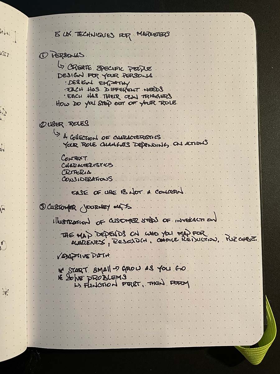
Brainstorming
We started with all the data and research we collected, the user testing, and began a sticky note wall. We listed out everything that was on the home page and started pulling notes out. First with sections or information that showed no signs of traffic or views. Then with sections that provided too many options to users. And we were left with only the most important information based on the data.

Personas

38 Years old
Self-Employed, Attorney
Married, children
Lives in Greensboro, NC
Vincent Clark
As a busy attorney, Vincent doesn't like wasting time. He knows that Professional Liability Insurance is a crucial component of keeping his practice protected, but doesn't feel he has the time to spend scomparing policies.
Vincent needs a company with a strong reputation and a dedicated sales associate so he never has to explain his needs twice. He wants to be able to fill out his application online and be kept up-to-date on its progress. And he doesn't want to wait around for coverage.
Vincent needs a strong coverage that will grow with his practice and to speak to the same person every time.
Behavior Traits
Tech savvy
Driven
Multi-tasker
Wants & Needs
High coverage
Ability to adjust
Dedicated Rep
Frustrations
Automated prompts
Repeating himself
Slow processes
Motivations
Helping people
Growing his firm
Becoming a judge

26 Years old
Licensed Realtor
Single
Lives in Anacordes, WA
Maria Holden
Maria got into real estate because she loves meeting new people and helping find the perfect home. She knows she needs insurance, but doesn't understand a lot of the language. She needs a company that can speak to her on her level and explain her policy and coverage thoroughly.
Maria is a busy real estate agent and doesn't have an assistant to help her or take on some of the busy work. She needs a company that is available in off-peak hours without lengthy wait times when she has questions.
Maria needs good coverage that will follow her if she changes brokers and doesn't want to be dependent on her brokerage to keep her properly protected.
Behavior Traits
Creative
Empathetic
Focused
Wants & Needs
E&O Coverage
Confidence in coverage
Thorough explanations
Frustrations
Industry jargon
Pushy sales reps
Uncertain language
Motivations
Growing clientele
Surpassing sales goals
Giving back
Initial Sketches and Whiteboards
We then began sketching and whiteboarding out ideas of the flow from start to finish. One of the challenges was that the company offered several products for different business types (lawyers, accountants, realtors, etc.) with industry-specific policies and information that needed to be displayed. The very first step was figuring out how to filter that traffic to the appropriate business lines, and then how a user within that industry would follow their path.
Diagraming user flow

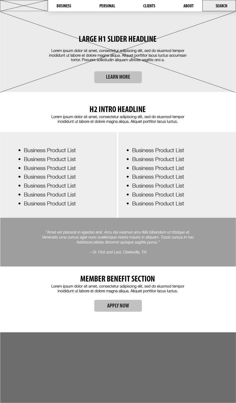
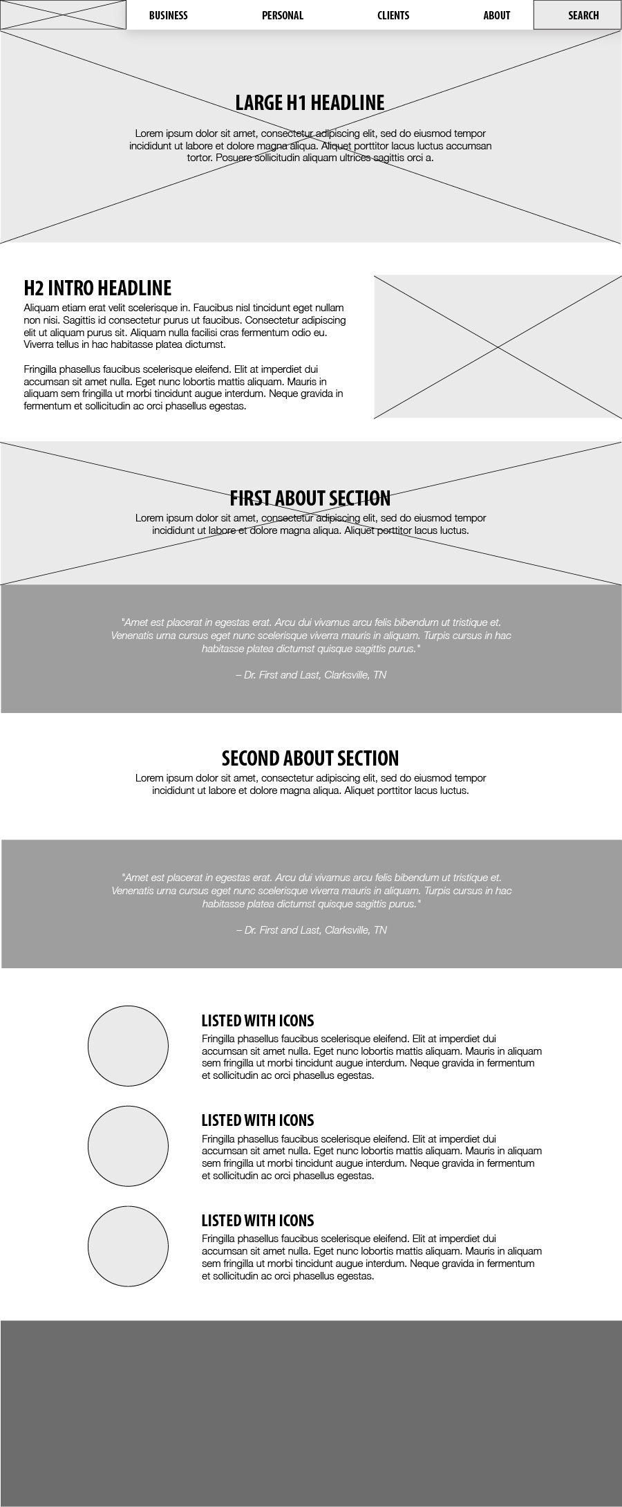
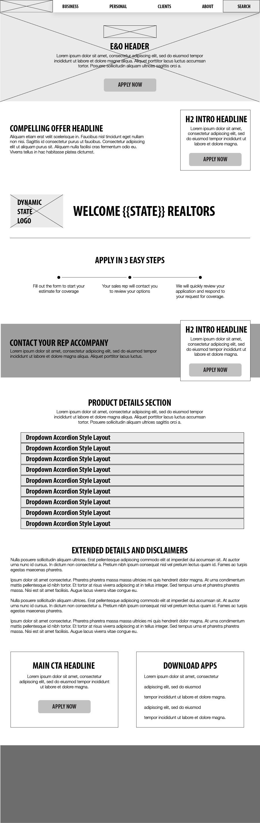
User Journey and Wireframes
Once we had a user flow that best fit the needs of our customer personas, we moved on to working through wireframes to create a user interface that was clean and consistent, while providing key components “above the fold” with clear calls to action for each user to guide them through their journey and convert on new insurance policies.
Home Page
About Page
Example Product Page
Prototypes
Once the wireframes were approved and we had successfully communicated both the how and the why of the UI and UX, we began developing high-fidelity prototypes. We first started with developing a design system for everything to follow, including font and color choices, the decision to use real employees in the company vs stock photography, and assembling a library of components for the site within our system. The users for the site are 40% mobile/60% desktop, so we knew a responsive design approach was a high priority.
Home Page

Basic Example Product

About Page

Dynamic Product Page
Dynamic Product Page
Careers Page
The Final Product.
The site was ultimately developed using a mix of ColdFusion, CF on Rails, and .NET, using Bootstrap as a framework. The focus remained on how the user interacted with the site and we were only able to achieve the results we did due to the extensive research and testing that went into the creation of the product.
Visit the WebsiteReview
In the end, the project was considered quite a success. The project still had a lot of cooks in the kitchen, but we feel we found a good balance between client-required content and necessary content attained during our discovery phase. Some of the pages were longer than we'd like, or more information-heavy that necessary. But balance is key and we achieved it.
In the first full year after deployment, we saw an 11% increase in applications received (as compared to prior growth that never topped 2.5% using the old platform). We were able to incorporate marketing automation in the new platform which was missing prior, streamlining the marketing to generate leads to the Sales Team.
The following year, Pearl Insurance went on to win 5 Gold Medals, 1 Silver Medal, and a PIMA Best In Show at the 2021 PIMA Insight Awards.